John Horsfall Rebrands
New brand identity launch
With plenty of exciting projects coming up this year, we felt that now was the perfect opportunity to refresh and reinvigorate our brand.
The BRIEF
To strengthen the brand to truly reflect the forward thinking, exciting, ambitious nature of the company. Ensure we have the tools needed now to compete in a busy market while keeping an eye on the future; creating an exciting new brand that customers, brand partners and employees will all be proud to be part of.
We turned to local brand and design consultancy, 10 Associates, They took us back to basics with a day in the classroom as part of their unique Brandschool® programme.
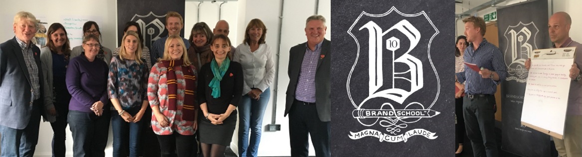
With 10’s expertise and a series of interactive group activities we were able to consolidate our company story and values which our clients already know and admire. We gained a greater insight into how that could be utilised to reflect our forward thinking, exciting and ambitious outlook. Ultimately, we just needed our brand identity to reflect what we have been doing for years.
brand essence and Values
As a family business with a long heritage, we’ve been refining our skills for over 150 years. Having worked with airlines for the last 40 years we have had plenty of time to hone our craft and cultivate our company culture. Therefore, we understand people’s needs when they travel and the levels of comfort and luxury they demand
We think creatively, we know our stuff and we obsess over detail.
brand reveal
Commencing with our new website reveal in March 2019, we have started to unveil the visual elements of our new identity – soon to be synonymous with the John Horsfall name.
LOGO
The new logo is classic and simple. It’s a strong and consistent representation of who we are even as trends change. In other words, simple and sophisticated in design, it represents us as a business, people and service. Therefore, it is the single most visible representation of our company and reflects everything we want to say about our brand.
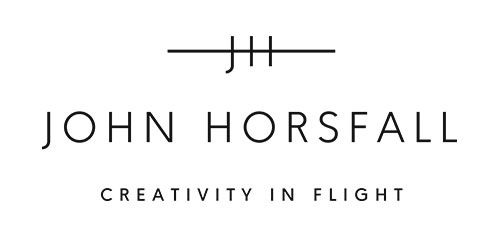
Our signature embraces what we believe matters most, the journey, and the experience of our customers. This encompasses not just the literal journey of flight and the comfort of passengers flying with our products, but also the journey we travel with our customers. Including product development, manufacture, supply & delivery, and how we can make this the best experience possible for them.
The 3 lines represent our core attributes; Detail, Design, Delight.
The supporting tag line, Creativity in Flight, helps to clearly define our position and communicates our strength effectively.
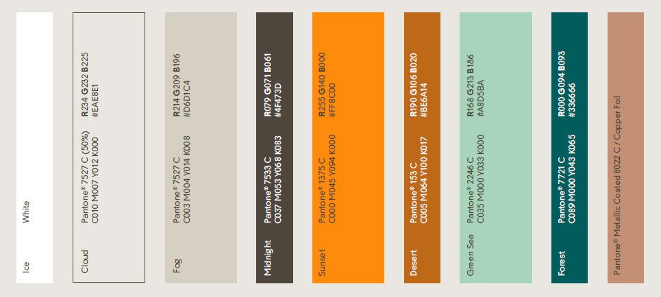
The new colour palette is key to the look of our brand. Rich in optimism it reflects our boldness and the tone of John Horsfall as an organisation.
NEXT STEPS
You will see the results woven through everything that we do.
You can keep up to date by joining our mailing list and following us on Instagram
The new look John Horsfall brand identity will be introduced to customers at WTCE in Hamburg. We can be found at stand number 1G80 from the 2nd to 4th April 2019.
We would be delighted to hear your thoughts on our new brand and website or to discuss any of your future projects – please get in touch or come and meet us at WTCE Hamburg!